
I conducted Information Architecture to improve the navigation, clarity, and accessibility of the Northern Illinois Special Recreation Association (NISRA) mobile page.
Optimal Workshop (Card Sorting, Tree Testing, First Click) Zoom, Google Forms, Figma, Zoom
1 Marketing Director
/w=3840,quality=90,fit=scale-down)
Research Process:

1. Discover
Project Overview:
The Northern Illinois Special Recreation Association (NISRA) provides year-round recreation activities for individuals with disabilities. However, its mobile site was difficult to navigate, cluttered, and lacked accessibility features, leading to user frustration and low engagement.
Problem Statement:
"How might we improve the NISRA mobile page to enhance usability, simplify navigation, and improve accessibility for participants and volunteers?”
Challenges:
- Confusing Navigation – Cluttered menus made it difficult to find information.
- Complex Task Completion – Registering for events or accessing volunteer info was frustrating.
- Overwhelming Information – Outdated content and unclear categorization reduced engagement.
Goal:
- Simplify navigation with a streamlined menu.
- Improve accessibility for users with disabilities.
- Optimize task completion by reducing steps to find programs & register.
Research Process
1. Content Inventory Audit
I conducted a thorough audit to identify redundancies, outdated content, and gaps.
Key Findings:
- Redundant labels and inconsistent terminology.
- Outdated content cluttering key sections.
- No clear categorization of volunteer or program details.

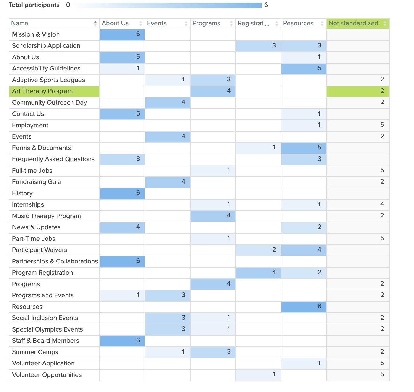
2. Card Sorting (2 Rounds: Closed & Hybrid)
Round 1: Closed Sort
Users struggled to locate volunteer applications, Special Olympics, FAQs, and Forms.

Round 2: Hybrid Sort
Improved categorization led to faster task completion and reduced navigation confusion.
3. Contextual Inquiries (User Observations via Zoom)

Participants: 10 users (individuals with disabilities, caregivers, staff).
Method: 30-minute real-time site navigation tasks.
Key Findings:
- Confusing categories caused frustration.
- Users wanted fewer, more distinct sections for quick access
- Outdated content led to disengagement and frustration.
"I keep clicking around just to find program info—it’s frustrating." – Participant
2. Define
User Personas
Alex represents the typical NISRA user—a caregiver or participant who needs quick access to program details and an easy way to register or volunteer.
Needs: Clear navigation, fewer menu options, accessibility-friendly layout.
Pain Points: Difficulty finding relevant sections, frustration with cluttered menus.

3. Develop
Revised Site Map
I created a sitemap outlining the new structure and organization based on insights gathered from the discover and define phase.
Key Improvements
- Streamlined registration, volunteer applications, and program access.
- Removed redundant labels and outdated sections.
- Reorganized sections (e.g., moved Summer Camps under "Programs" and Volunteer Roles under "Employment").

Prototyping/Wireframing
I developed initial wireframes to visualize the redesign of the NISRA mobile page, focusing on improved user flow and accessibility.
Key Improvements:
- Simple, mobile-first layout with clear labels.
- Large touch targets for easy navigation.
- Clearer labels and menu structure.


4. Deliver
Tree Testing
Method: Conducted two rounds of Tree Testing with 6 participants each, focusing on key navigation tasks.
Task | Success Rate | Avg. Time to Completion | Error Rate |
Locate Summer Camps under "Programs" | 74% | 15 sec | 26% |
Find Volunteer Opportunities | 88% | 20 sec | 12% |
Register for an Upcoming Event | 79% | 18 sec | 21% |
Locate Accessibility Resources | 92% | 12 sec | 8% |
Key Takeaways
- Clearer Labels Helped – Accessibility Resources had 92% success after renaming.
- Registration Confusion – Users expected event sign-ups under "General Info", leading to a 21% error rate.
- Summer Camp Placement Issue – 26% of users looked under "Youth Programs" first before finding the right page.
- Navigation time reduced to under 30 seconds.
First Click Testing
Goal: Measure how quickly users find key features.
Method: Conducted two rounds of First-Click Testing with 6 participants each to measure:
Key Findings:
- Faster Access to Accessibility Resource – (90% success, 5 sec) Users found this section quickly, confirming better visibility.
- Event Registration Still Needs Refinement – Some users hesitated between "Programs" and "Events" tabs.
- Volunteer Section Slightly Confusing (83% success) – Some users expected it under "Community" instead of "Employment."

Iteration
Key Task 1: Finding & Registering for Summer Camp
Issue: Users struggled to find summer camp registration under "Programs."
Solution: Moved "Summer Camps" under "Programs & Events" for clarity.

Key Task 2: Finding & Applying for Volunteer Opportunities
📌 Issue: Volunteer application was hard to locate.
✅ Solution: Grouped volunteer roles under "Employment" for better visibility.

4. Deliver
Final Product
Overall Impact of Iterations
- Simplified navigation reduced confusion.
- Users completed tasks faster with clearer pathways.
- Higher engagement with structured, intuitive content.

Post-Launch
1 month after launch:
85% of the users were satisfied with the new simplified navigation
- Faster task completion & reduced frustration.
User Feedback:
“Finding what I need is so much easier now!”
“I love how the programs are grouped—it makes sense.”

Conclusion
The NISRA mobile page redesign improved usability, accessibility, and navigation, making it easier for participants and volunteers to find information.
- 85% user satisfaction with simplified navigation.
- Faster task completion & reduced frustration.
- Increased engagement with clear, structured content.
By focusing on user needs and accessibility, this redesign created a more inclusive and intuitive experience for all users.
What I Could Have Done Differently
- Introduce A/B testing for direct comparisons.
- Test with larger participant groups to enhance insights.
- Use heatmaps to track user behavior on key pages.
Key Takeaways
- User feedback is key– Real insights drive better design.
- Small changes have a big impact – Simplifying menus reduced frustration.
- Accessibility benefits everyone – Inclusive design improves the experience for all users.
Next Steps:
- Monitor usability and refine based on feedback.
- Ensure ongoing WCAG compliance updates.
- Expand testing to more diverse users.